Along with my colleagues Ivan Dimitrijević and Milan Lipovac, I recently took part in the international conference “Urban Security and Urban Development”, hosted by the Faculty of Architecture and the Faculty of Security Studies of the University of Belgrade. During the plenary session, we presented our pilot research “Automated monitoring of Security-Related Events in Urban Areas” and I will explain our main ideas and results briefly in the following text.
Introduction
As with any other analysis, relevant and timely data make security assessments more aligned with the actual security dynamics in a given zone of interest. If we think about urban security, what should come into mind is the interplay between the architectural solutions and the social context in which they are embedded. In order to better understand this important interaction from the security perspective we need a lot of so called static data, which is data that most commonly changes relatively slowly, like demographics, social structure, education level, etc. But, in order to have a more complete picture, in order to better understand crime patterns associated with certain place, we also need quality insight into the real-time dynamics of crime events.
Data about crime events are very dynamic so we have short collection cycles. Police organizations are naturally very good at collecting and organizing such data, but they most often do not have the capacity to provide a direct link to their databases for other stakeholders, especially for academics and researchers. There are some exceptions, but we should not be too optimistic about the possibility to get daily updates on crime frequencies from the police, both because of their inherent closeness, and because of complex and slow administrative procedures for obtaining such data.
Having that in mind, the following question naturally arises: can we find another way to correctly approximate spatial and temporal crime dynamics?
We argue that there is another way and we are trying to build such a system and task it with non-stop monitoring of the situation. Please note that we are at the beginning of our journey, but nevertheless we think that this is the best moment to demonstrate our ideas because we are now in best position to incorporate critiques into our project.
Selecting Data Sources
Since we know that we’re looking for current and reasonably detailed crime reports on personal and property security, exploring local news sources was an obvious choice. There we found most of what we needed, but in form of a large quantity of unstructured text. So, in order to take a full advantage of the selected data source, we had to find a way to deal with it automatically.
In other words, we needed to find a way to: (1) discriminate between crime and non-crime events in the news stories and (2) to parse and structure crime stories, and extract as much structured data as possible and (3) to store relevant data in a database.
So, now we were confronted with text-classification and text-mining tasks which required us to do a little programming and eventually statistics/machine learning.
Working with Text Data
In order to give you the intuition on text classification, I will skip technical details and use just a common language. Suppose I give you a bunch of documents, each of which has a label attached. Let’s say, there are five labels. Then you need to read the documents and hypothesize why each document had been given a concrete label based on its content (namely – words). Finally, I present you a new document and ask you to label it, based on what you know from previous steps. I suppose you would make a correct guess in most of the cases. But the real challenge is to teach a machine to do the same task. That’s where statistical learning (or machine learning as it is called nowadays) comes into play. It’s a fairly complex topic so I’ll just mention a few things relevant for our project.
A Few Relevant Machine Learning Concepts
The kind of learning I just talked about is called a supervised learning, since you have been given examples of documents and then you base your decision about new documents on these examples. Also, when you need to discriminate between just two categories, for example between crime and non-crime events, then you have a so called binary classification problem. You need to restate this binary classification problem numerically, which means that you have to numerically represent collected textual corpus and apply some quantitative procedures in order for computer to learn something about those texts and make a decision.
You basically need to transform text into numbers and define a hypothesis function that will apply some logic or model to unknown data and try to guess it’s label. Then you need a so called cost function or error function that will compare this guesses with real labels and calculate an error in order to check the precision of this classification. The whole point is for computer to use presented data to establish a so called decision boundary which splits the dataset into classes or categories. In case of binary classification: two categories.

Our Approach to Text Classification
First of all, when you have some textual fragment and you want to transform it to numerical form, you add a certain numerical value or so called weight to words. What you could do is to count how frequently a word or term appears in a given document or corpus. This metric is called Term Frequency. But the problem here is that there are many insignificant (stop) words like ‘a’, ‘the’, etc., that carry minimal meaning but they are very frequent. On the other hand, you can also measure how unique a word is, or how infrequently the word occurs across all documents (this is called Inverse Document Frequency or IDF). This should point out more meaningful words. You can also calculate the product of these two measures called TF-IDF and get one of the standard metrics of how much information a word provides.
So the main problem here is to select text features that are most indicative for a certain class of articles. Those attributes that contribute more information will have a higher information gain value and can be selected, whereas those that do not add much information will have a lower score and can be removed from our classification model. We could measure information gain with its entropy score. In this context, the entropy is minimal, equals 0, if the some term “j” appears only in one category. We consider that this term might have a good discriminatory power in the categorization task. Conversely, the entropy is maximal if the term “j” is not a good feature to represent the documents of certain class. For example, if it appears in all the categories with the same frequency.

A thing to note here is that, although statistics is of much help while selecting most representative features from text, deep knowledge of the problem domain is also needed.
We made an assumption that a term which is characteristic of a category must appear in a greater number of documents belonging to this category compared with other categories, but it should also appear more frequently than unrelated terms. Then we tried to empirically determine a set of representative words for certain types of criminal activities that we are interested in – namely robberies, attacks, and similar things.
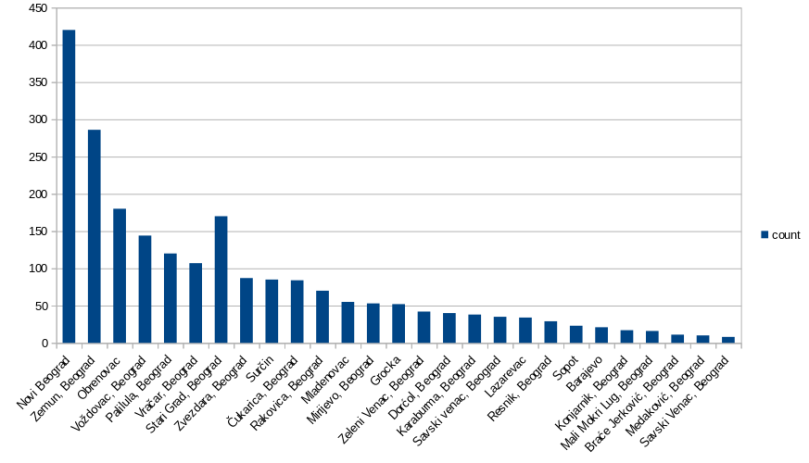
The first thing we did was the selection of news sources covering Belgrade city region, which was in the focus of our study. There are a few notable news sites that we investigated, like Blic, Kurir and Vecernje Novosti, just to name a few. While Blic and Kurir have the most visitors, and Blic has an extensive archive reaching all the way to the year 2000, the content provided by Vecernje Novosti was the most detailed and best suited for our analysis.
So we politely scraped five years of Belgrade local news from Vecernje Novosti website using a Python script and got a sample consisting of 10.725 news articles. Then we cleaned and transformed this data and saved it to our local storage in order to build a sample of relevant textual corpus.

After that, we began hunting for text features. This is, by the way, called Feature Engineering or Feature Selection phase. But then we encountered the first problem: the number of relevant news articles was very low, namely it was just below 7 percent of total sampled data. That’s why we decided to scrape more data from other websites, at the same time covering larger time span, in order to manually build our first set of representative words, which we could later improve.
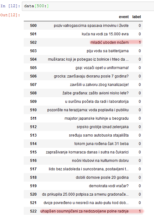
When we enriched our sample, we began to process it. First, we removed so called stop words which are considered noise. Then we looked at term frequencies and similar measures. Finally, we used our domain knowledge and intuition. We came up with a dictionary of 513 more or less indicative words. This is still very rough, but in the future we plan to optimize the size and content of this set. For those of you that speak Serbian, some of the words are shown on the slide. Notice that we have used only the fixed part of a word that is not changing with tense, gender, case, etc. We used the same technique for the detection of locations in the text, but this is rather primitive and we will soon hopefully incorporate very detailed geocoding using OpenStreetMaps data and a few other python libraries.
Then we developed a rudimentary scoring function just as a proof of concept. The algorithm of the scoring function was very basic: if a significant word is found, raise relevance score of the article for a certain amount. We then scored two groups of 200 articles from Crime and Non-Crime class that we earlier manually classified. We compared the mean score of these groups of articles to check if the scores are informative and usable for decision boundary setting. It turned out that there is a notable difference in Crime class mean score in comparison with Non-Crime mean score, but there also was some overlap. Namely, Crime class mean relevance score was 14.05 points with the standard deviation of 5.11 points, while Non-Crime class relevance mean was 8.7, with the standard deviation of 3.54.
Based on these results, we wanted to see what would happen if we say that it’s safe to classify an article with the score equal or larger than 14.05 as a crime event, just as any article with the score below 3.54 as non-crime event. In that case, the area of reduced certainty was between these two means, and we split this range with our decision boundary exactly in the middle with the value of 10.98.
With this settings, our primitive and certainly to some extent overfitted testing classifier was able to correctly classify 72.5% of cases from our sample corpus. We have also noticed that the significant number of our false-positive results were either short crime texts, since there are fewer words to score so the overall score cannot be sufficiently large to pass the decision boundary, or cases of emergency situations and traffic accidents which were described with a lot of shared terms as violent attacks. So, we could say that this is a kind of proof-of-concept achievement and in the future iterations we plan to significantly improve our model.
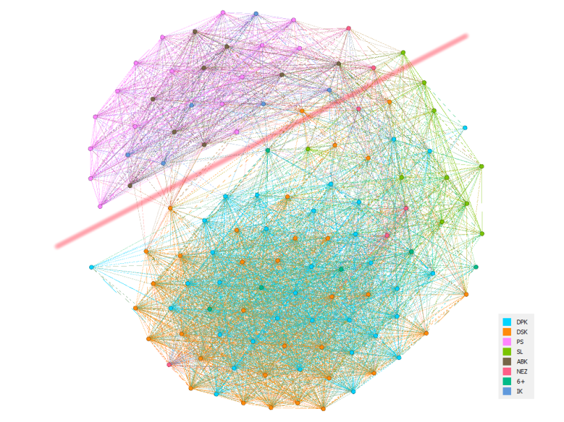
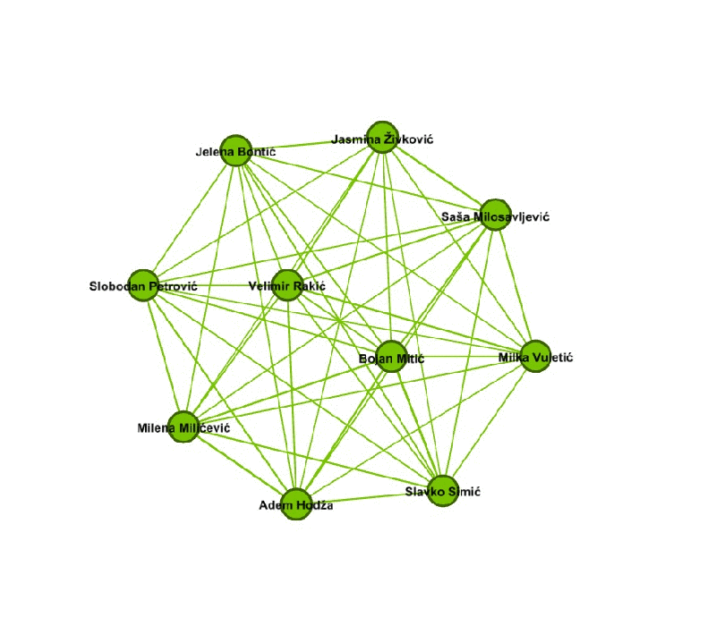
Demo Visualizations