Among the topics I am highly interested in are network representations and exploration of political and social structures. Here are some samples of my work.
1. Proximity indicators in public political statements

Project description
The purpose of this mini-project was to compile the dataset from local media sources, analyze the content of scraped news articles and code the statements of various political parties’ representatives about the possibility of mutual cooperation. Statements were classified into three categories: positive, negative and neutral. Time span of the study was two months.
Data was transformed and converted into network using NetworkX Python module. Finally, the graph was stylized using Gephi.
Numerical representations of proximity (edge weights) used to build the graph are:
ldk {'vv': -1, 'pdk': -11, 'aak': -3, 'nisma': -1, 'akr': 2, 'alternativa': 2}

akr {'pdk': -2, 'aak': -2, 'nisma': -2, 'vv': 2, 'alternativa': 1}

vv {'pdk': -2, 'ldk': 1, 'akr': 1, 'sl': -1, 'nisma': 1}

aak {'pdk': 0, 'nisma': 2, 'ldk': -1, 'vv': 1, 'sl': -1}

alternativa {'pdk': -2, 'aak': -1, 'nisma': -1}

pdk {'ldk': -3, 'nisma': 4, 'aak': 3, 'vv': -1}

nisma {'aak': 3, 'pdk': 0}

sl {'pdk': 1, 'ldk': 1, 'sl': -2}
The final graph depicts the structure of political relations based on the proximity of parties. Darker edges mean higher weights, while the numerical label of edge weight is colored from red (lower weight) to green (higher weight). Size of nodes represents outdegree (the bigger the size, the more statements the party gave) and the color of node represents indegree (the darker the color, the more statements are made about the party).
Results interpretation
Available data suggests that the political scene in Pristina is notably divided into two blocks which generally corresponds with pre-electoral coalitions. In case PDK-AAK-NISMA coalition fails to form a government, the graph suggests that there is a possibility of alignment among Vetëvendosje and some of the parties from LDK-AKR-Alternativa coalition, since they expressed more positive statements about each other and their proximity index is thus higher. Data also shows that Serbian List (SL) is facing cohesion problems, since its leaders issued negative statements about each other. Of course, eventual predictions of post-electoral dynamics based only on these indicators are not so useful, since public statements should not be interpreted as reliable clue of real political intentions. Contrary to that, they are just general contextual features of the current political setting.
2. Proximity indicators in voting patterns
Project description
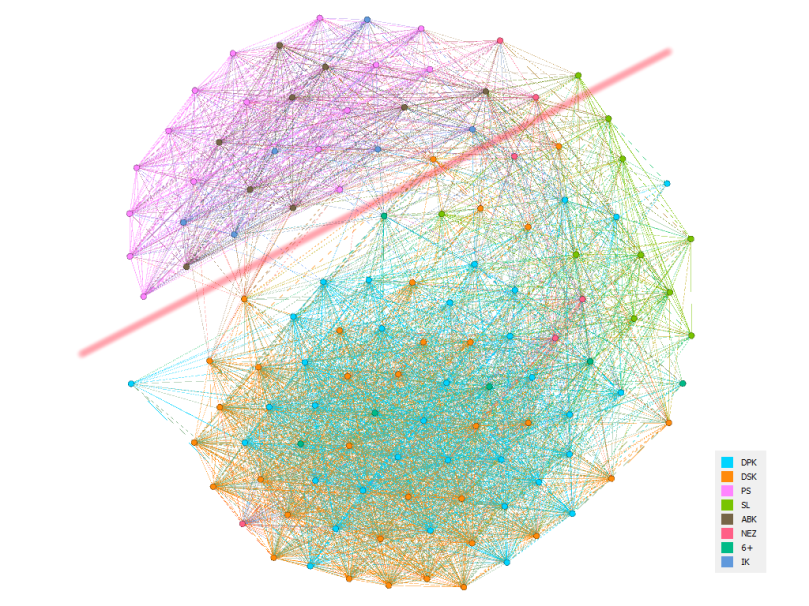
Considering that cohesion is one of the most important measures when it comes to the exploration of intraparty and coalition dynamics, there is a need to model political proximity relations as accurately as possible. The graph shown above is based on “roll-call votes” (RCV), e.g. votes of MPs recorded by electronic system, which were later published on the website of the Kosovo Assembly. Even though these recordings comprise the largest number of voting activities of Kosovo MPs, we should notice that the present electronic system does not include all voting procedures of the Kosovo Assembly, primarily because MPs sometimes use voting methods other than the electronic system (secret ballot for example). However, these situations are not so often in the Kosovo Assembly, which makes RCV a reliable source for conducting research on Kosovo MPs voting behaviour. The time span of the research is December 2014 to December 2016, e. g. the first two years of Isa Mustafa’s Government.
Sampled RCV records included five types of different data on every bill or motion voted upon in the Kosovo Assembly: date of voting procedure, name of MP, her/his party affiliation, weather she/he was present at the voting, and her/his vote in three categories (“yes”, “no”, “abstain”). This data was later transformed into “similarity matrix” which was used as a basis for the graph creation (again, using NetworkX module and Gephi).
Interpretation
In summary, what can be concluded is that voting behavior of Kosovo MPs reflected political dynamics of their parties, which could be seen in many examples of major political events. Also, two measures of cohesion (a kind of political proximity metric) of the parliamentary groups have been used in the research and one of them (voting agreement index) outperformed the other (social network modularity measure). Including datetime codes into the dataset enabled tracking of the changes in parliamentary groups cohesion in the longitudinal sense, which most of the time faithfully reflected the actual political dynamics. Consequentially, the above graph generally corresponded well with the actual structure of the Parliament at the time and the divisions between the opposition (the part of the graph above the red line) and the ruling parties (below the line) are clearly visible at the highest level of aggregation.

I see that this is your first post in this blog. I hope to read more from you
LikeLiked by 1 person
Thank you very much, Boris! Coming from someone with such an impressive bio it really is a pleasure.
LikeLiked by 1 person